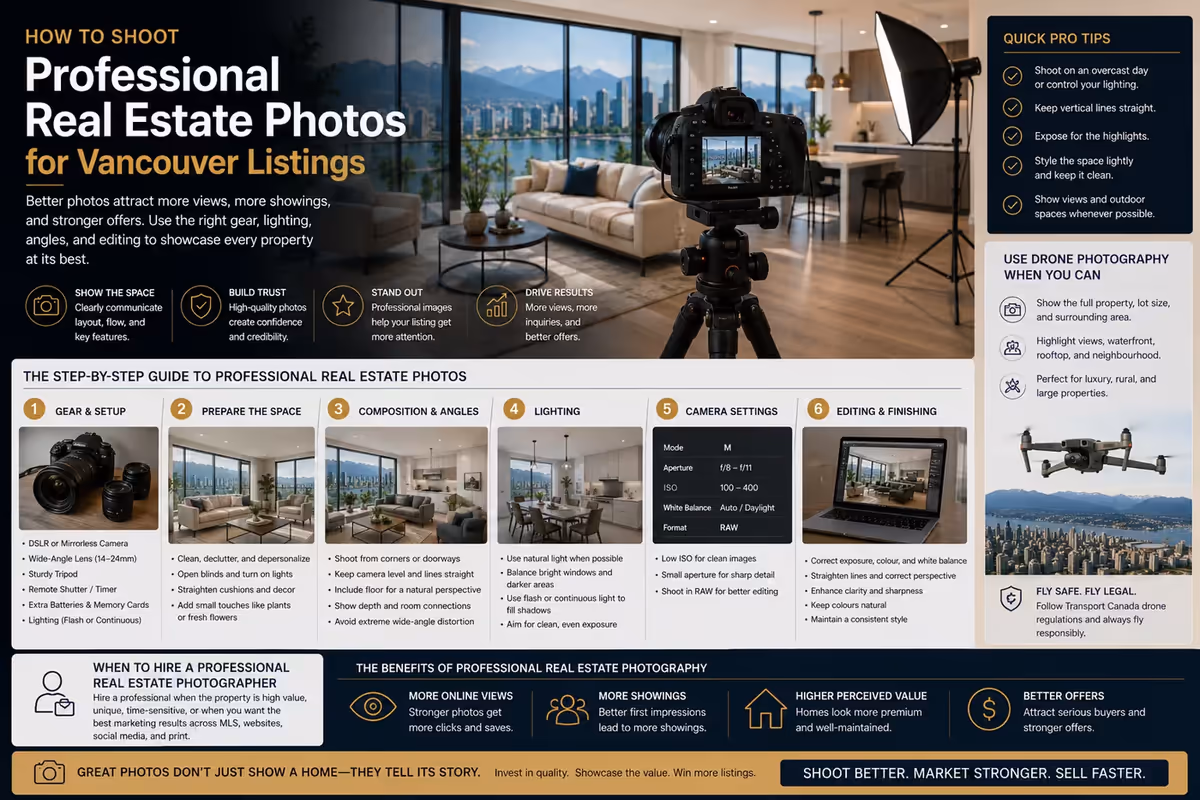
Why Composition Decides Whether Listing Photos Feel Professional
A real estate photo can be sharp, bright, and technically clean but still feel wrong. Often, the issue is composition.
Composition is the way visual elements are arranged inside the frame. In real estate photography, it affects how buyers understand room size, layout, light, flow, and property quality. A well-composed image makes the space feel clear and intentional. A poorly composed image can make the same room feel smaller, distorted, cluttered, or less valuable.
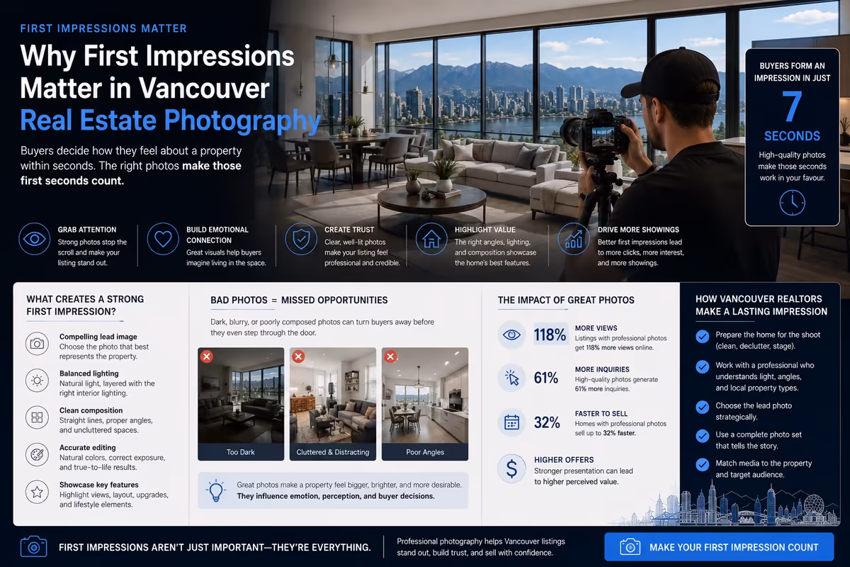
For Vancouver realtors and brokerages, composition matters because listing photos are usually the first visual impression buyers get online. A buyer may scroll through several listings in one session. If the images feel clean and professional, the property has a better chance of holding attention. If the images feel rushed or awkward, the listing may lose interest before the buyer reads the details.
Professional real estate photography does not guarantee more showings or faster sales. Pricing, location, condition, inventory, and timing still matter. But strong composition can make the listing easier to understand and more credible online.
Key Takeaways for Stronger Real Estate Photos
Good real estate photo composition is not about making a property look unrealistic. It is about presenting the space clearly, accurately, and professionally.
For most listings, the strongest photos follow a few core principles:
- Keep vertical lines straight.
- Use camera height intentionally.
- Choose angles that explain the room.
- Avoid unnecessary distortion.
- Use light to guide attention.
- Give important features enough space in the frame.
- Create balance without making every image feel identical.
- Remove distractions before shooting.
- Make the photo sequence feel logical.
These details may seem small, but they change how buyers experience the listing.
A strong listing gallery should not feel like a random set of room images. It should guide the viewer through the property with clarity.
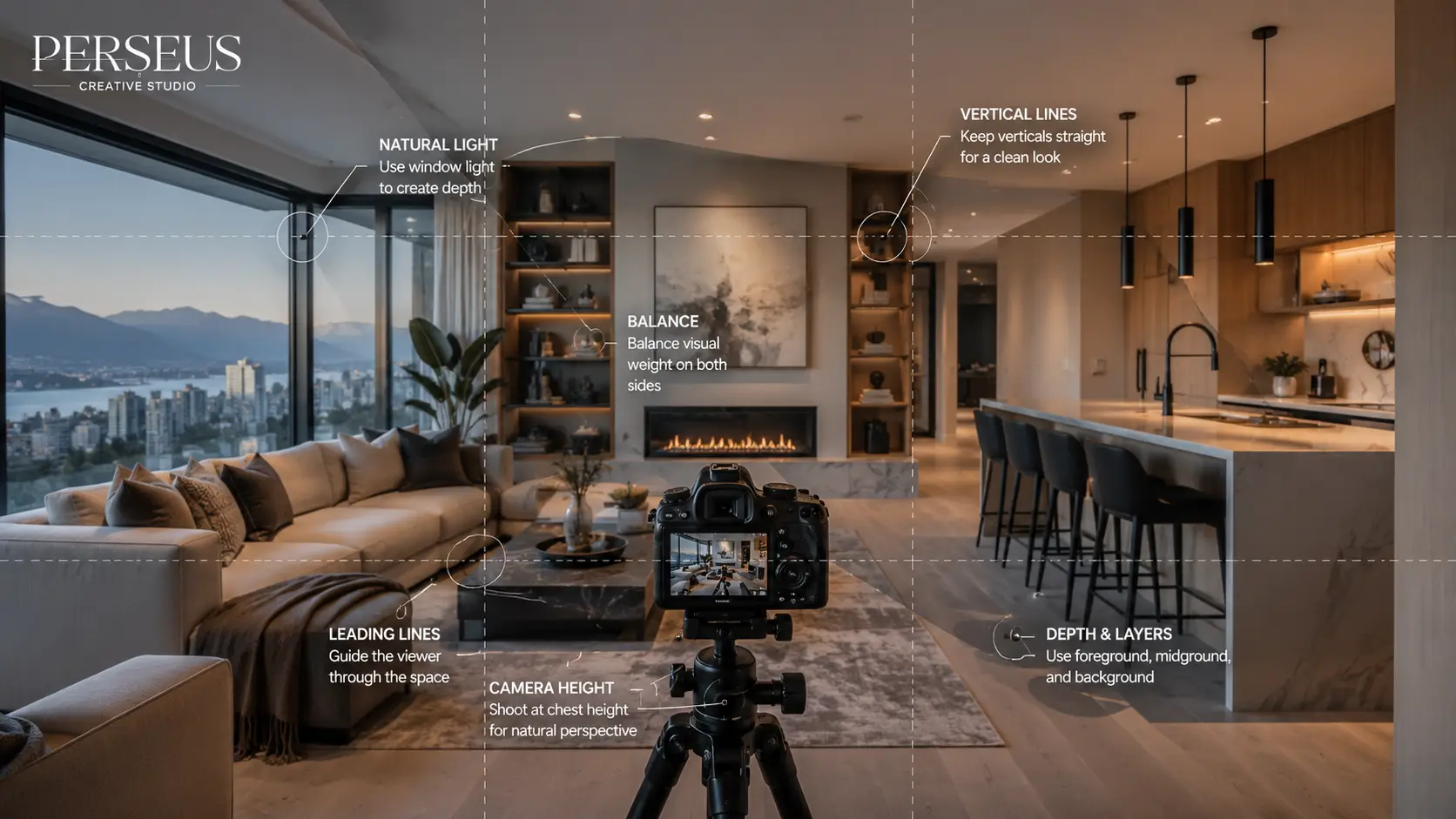
Camera Height Shapes How the Room Feels
Camera height is one of the easiest composition details to overlook. It also has one of the biggest effects on how a room feels.
If the camera is too high, furniture can look compressed and the room may feel unnatural. If the camera is too low, counters, beds, sofas, and tables can feel oversized or distorted. The goal is to choose a height that presents the room honestly while keeping the perspective comfortable.
For many interior real estate photos, a mid-level camera height works best. It keeps the viewer’s eye close to how the room would feel in person. Kitchens, bathrooms, bedrooms, living rooms, and dining areas may each need slightly different positioning.
The right height depends on what the image needs to communicate.
A kitchen photo may need to show counters, cabinets, appliances, and sightlines. A bedroom photo may need to show the bed, windows, and usable floor area. A living room photo may need to show seating, windows, fireplace, and connection to the dining area.
For Vancouver condos and townhomes where space efficiency matters, camera height becomes even more important. The image should show function clearly without exaggerating the room.
Choose Angles That Explain the Space
A strong real estate photo should answer a buyer’s question. What is this room? How does it work? Where does it connect? What is the main feature?
The best camera angle is usually the one that explains the room most clearly.
In many cases, shooting from a corner or near a doorway can help show depth and layout. It allows the frame to include multiple walls, furniture placement, windows, and room connections. But this does not mean every image should be shot from the widest possible corner.
A wide image can be useful. An exaggerated image can feel misleading.
The goal is to show enough of the room for buyers to understand it while keeping the proportions believable.
For tighter spaces, such as dens, bathrooms, condo bedrooms, or narrow kitchens, the photographer may need to test several angles. Sometimes the best composition is not the widest shot. It may be a cleaner angle that shows the main function without forcing too much into the frame.
A listing gallery should include enough variety to explain the home without becoming repetitive.
Avoid the Flat Middle-of-the-Room Look
Standing in the middle of a room and pointing the camera directly forward can sometimes work, especially when symmetry is the point. But in many real estate photos, this approach can flatten the space.
A flat image may fail to show depth, flow, and relationship between features. It can make the room feel less dynamic and less useful.
Instead, strong composition often uses a slight angle to show how the room opens, how furniture is arranged, where the windows are, and how the space connects to nearby areas.
For example, a living room image may be stronger if it shows the sofa, window, fireplace, and connection to the dining area in one clean composition. A kitchen image may work better if it shows the island, appliances, and sightline into the living area.
The best angle is not always the most dramatic. It is the one that helps the buyer understand the space fastest.
Keep Vertical Lines Clean
Crooked vertical lines are one of the fastest ways to make real estate photos feel amateur.
Door frames, window frames, cabinets, walls, and built-ins should usually appear straight. When verticals lean, the room can feel unstable or distorted. Buyers may not consciously identify the issue, but the image often feels less polished.
This is especially important in Vancouver listings with modern architecture, tall windows, custom cabinetry, feature walls, or clean interior lines. These details need careful framing.
Straight verticals can be managed through:
- Camera positioning
- Leveling the camera before shooting
- Using grid lines or an in-camera level
- Avoiding excessive upward or downward tilt
- Correcting perspective carefully in editing
Perspective correction should be used carefully. The goal is to clean up the image, not stretch the room into something inaccurate.
Professional real estate photography should make the property look polished without breaking trust.
Use Symmetry When the Room Supports It
Symmetry can create calm, order, and a sense of quality. It works well when the room naturally has a centered feature.
Examples include:
- A bed between two nightstands
- A fireplace centered between built-ins
- A kitchen island aligned with pendant lights
- A dining table centered under a fixture
- A bathroom vanity with balanced mirrors
- A hallway leading toward a feature wall
When symmetry exists, composition should take advantage of it. A centered frame can make the image feel more deliberate and architectural.
But symmetry should not be forced. Some rooms are not symmetrical, and trying to make them appear symmetrical can create awkward framing. In those cases, balance is more important than perfect symmetry.
A balanced image can have different elements on each side of the frame while still feeling stable.
For real estate agents, the practical lesson is simple: the best composition should match the room. A polished photo does not need to make every space look identical.
Balance the Frame Without Overcrowding It
Balance is about visual weight. A room can feel balanced when furniture, windows, decor, and architectural features are arranged in a way that feels stable inside the frame.
If one side of the photo is visually heavy and the other side is empty, the image may feel unfinished. If every part of the image is filled with objects, the room may feel cluttered.
Good composition gives the important features enough room to breathe.
This is where negative space helps. Negative space is the open area around the subject. In real estate photography, it can help show flow, floor area, wall space, or a clean transition between rooms.
Negative space is especially useful in smaller Vancouver homes and condos. If the image is packed too tightly, the space can feel cramped. If the composition leaves some visual breathing room, the room can feel more understandable.
The key is restraint. A photo should not feel empty, but it also should not fight for attention in every corner.
Lead the Buyer’s Eye Toward the Best Feature
Strong real estate photos guide attention.
Lines, light, furniture placement, flooring, countertops, beams, windows, and hallways can all direct the viewer’s eye through the frame. A good composition uses those elements intentionally.
For example:
- Flooring lines can lead toward a living area.
- A kitchen island can guide attention toward appliances or windows.
- Window light can draw the eye toward a view.
- A hallway can create depth and movement.
- A table can point toward a fireplace or feature wall.
- Ceiling beams can emphasize architecture.
The buyer should not have to search for the purpose of the image. The frame should make it obvious.
If the strongest feature is the view, the composition should support the view. If the strongest feature is the kitchen island, the frame should make the island feel central. If the strongest feature is indoor-outdoor flow, the photo should show the connection clearly.
This is how composition turns a room photo into a marketing asset.
Use Light as Part of the Composition
Light is not only a technical issue. It is also a compositional tool.
Natural light can create direction, depth, contrast, and mood. Window light can guide attention toward a view or make a room feel more open. Soft light can make interiors feel calm and clean. Poor light can make even a well-composed room feel flat or uninviting.
For Vancouver properties, light can be a major selling point. Buyers often care about brightness, view exposure, window size, and how a home feels during the day.
A good real estate photo should use light to support the room’s purpose.
This may mean shooting at a specific time of day, opening blinds, balancing interior lights, managing window exposure, or choosing an angle that makes the light feel natural.
The mistake is treating light as something to fix only in editing. Editing helps, but the strongest images are usually planned well before post-production.
Compose for the Lead Image
The lead image deserves special attention because it often determines whether a buyer opens the listing.
The best lead image is not always the front exterior. It depends on the property’s strongest selling point.
For some listings, the lead image may be:
- A bright living room
- A renovated kitchen
- A mountain or water view
- A polished exterior
- A dramatic entry
- A balcony or patio
- A strong aerial-style perspective
- A feature room with excellent light
The lead image should communicate value immediately. It should be clean, simple, and visually strong at small sizes because many buyers will first see it on mobile.
A lead image with too much clutter, too many competing elements, or weak composition may fail even if the room itself is attractive.
For Vancouver realtors, lead image selection should be strategic. Choose the image that best represents why the property deserves attention.
Frame Views Without Losing the Room
Views are valuable, but they can be difficult to photograph well.
A common mistake is exposing for the room and losing the view, or exposing for the view and making the room feel dark. Another mistake is focusing so heavily on the window that the rest of the room becomes unclear.
The best composition shows both context and value. The buyer should understand the room and the view’s relationship to it.
For example, a living room with a mountain view should not only show mountains. It should show how the living room is positioned to enjoy that view. A balcony photo should not only show the skyline. It should show the balcony’s usability and connection to the interior.
The composition should answer: what does this view mean for daily life in the property?
That is more useful than a scenic image alone.
Make Small Spaces Feel Clear, Not Exaggerated
Small rooms require careful composition. The goal is to make them understandable, not artificially large.
Using an overly wide lens or extreme angle can create distortion. Buyers may feel misled when they visit in person and the space feels different from the photos. That can damage trust.
Instead, small spaces should be photographed with clarity.
For compact bedrooms, dens, bathrooms, and condo living areas, good composition should show:
- Room function
- Usable floor area
- Window placement
- Storage or built-ins
- Door swing and access
- Relationship to nearby spaces
Sometimes a tighter but cleaner image is better than a wide image that distorts walls and furniture.
For Vancouver condos, where efficient floor plans are common, this matters. Buyers want to understand whether the space works, not just whether the photo looks dramatic.
Use Detail Shots With Intention
Detail shots can help communicate quality, but they should not replace clear room images.
A good detail shot may highlight:
- Stone countertops
- Custom cabinetry
- Lighting fixtures
- Hardware
- Tile work
- Fireplace materials
- Built-in storage
- Appliances
- Flooring
- Architectural features
Detail photos work best when they support the overall listing story. A renovated property may need detail shots to show finish quality. A character home may need details that show original charm. A luxury property may need refined close-ups that communicate craftsmanship.
The mistake is using detail shots as filler. Every detail image should have a reason.
If the feature does not influence buyer perception, it may not need its own photo.
Create a Photo Sequence That Feels Natural
Composition does not only apply to individual images. It also applies to the full gallery.
A strong listing gallery should move logically through the property. Buyers should not feel lost or forced to piece the layout together from disconnected images.
A common sequence may include:
- Lead image
- Exterior or main living area
- Entry or orientation image
- Living room
- Kitchen and dining area
- Bedrooms
- Bathrooms
- Flex spaces
- Outdoor areas
- Views or location context
- Supporting detail images
The order should match the property. A condo with an exceptional view may lead differently than a detached home with strong curb appeal. A luxury property may need a more editorial sequence. A family home may need a clearer functional progression.
The photo gallery should feel like a guided walkthrough, not a shuffled folder.
Common Composition Mistakes Realtors Should Notice
Realtors do not need to become photographers, but they should know what weak composition looks like. This helps them evaluate listing media before it goes live.
Common issues include:
- Crooked vertical lines
- Camera height that feels too high or too low
- Overly wide distortion
- Too much ceiling or floor
- Furniture cut off awkwardly
- Important features placed too close to the edge
- Rooms photographed from unclear angles
- Repetitive images with little new information
- Clutter competing with the room
- Poor lead image selection
- Dark windows or blown-out views
- Photo sequences that confuse the layout
These issues can make a listing feel less professional. Correcting them helps the property feel more intentional online.
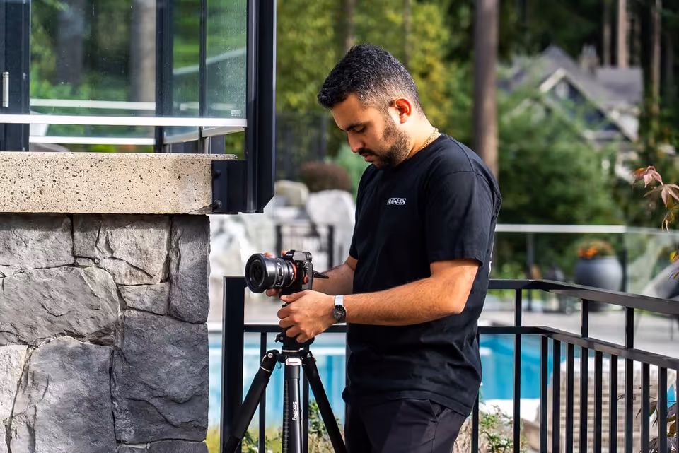
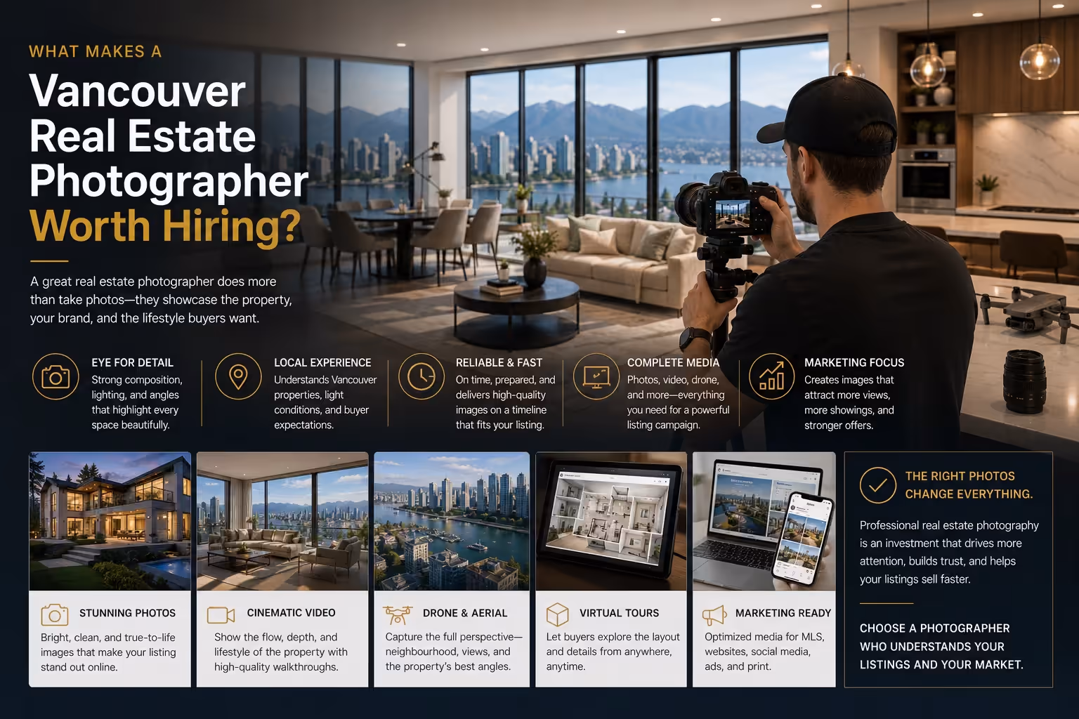
How Perseus Creative Studio Approaches Real Estate Photography
Perseus Creative Studio helps Vancouver real estate agents and brokerages create professional listing media for modern property marketing.
Our real estate photography approach focuses on clarity, composition, and usability. The goal is not only to capture attractive images. The goal is to create listing media that helps buyers understand the property and helps agents present it with confidence.
That means thinking about the full visual system: lead image, room angles, lighting, sequence, detail shots, exterior context, and how the final assets will be used across MLS, websites, social media, email, and listing presentations.
A downtown condo, North Vancouver townhome, East Vancouver family home, and West Vancouver luxury property should not all be photographed the same way. Each property has different strengths, constraints, and buyer expectations.
Strong composition helps the media reflect those differences.
Explore our real estate photography and listing media services, or contact Perseus Creative Studio to plan photography for your next Vancouver listing.
Key Takeaway
Real estate photo composition affects how buyers understand a listing online. Camera height, room angles, vertical lines, balance, light, detail shots, and gallery sequencing all influence whether a property feels clear, professional, and worth exploring.
For Vancouver realtors, strong composition is not just a photography detail. It is part of the listing strategy. Better-composed images can make property features easier to understand, strengthen online presentation, and support the agent’s overall marketing standard.