A look that’s
unmistakably yours.
Logo, color, and type — a complete visual identity system that looks credible at any size and consistent across every place your brand shows up.
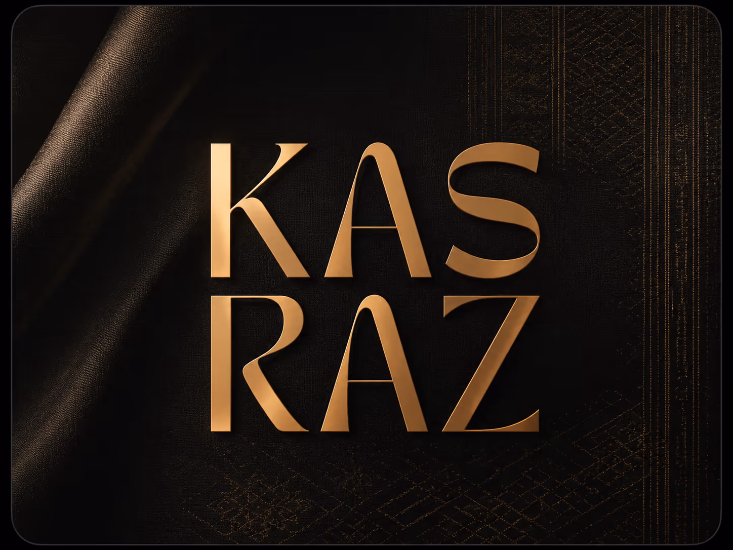
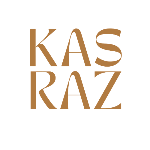
Perseus
A complete identity — not just a logo.
Ink
#141414
Bone
#F5F2EC
Ember
#C4502E
Stone
#8A8378
Built to be recognized
Clear, consistent, unmistakably you.
A logo is the start. A system is the point.
A single mark can’t carry a brand on its own. What makes you recognizable is the whole system working together — the logo, a considered color palette, type that has a voice, and clear rules for how it all goes together. We design the system, so you look like the same confident brand on a sign, a screen, and a social post.
- Logo & monogram suite
- Color & type system
- Consistent across every touchpoint
- Production-ready files
A logo isn’t drawn. It’s engineered.
Construction, lockups, reversibility, and scale — the rules that make a mark hold up everywhere it lands. This is the difference between a logo and an identity system.
Drawn on a grid with protected clearspace, so the mark holds its proportions everywhere it’s placed.
Primary, horizontal, and stacked — a lockup for every space.
Reversible and single-color safe — it works on ink, on light, and on brand color without losing the mark.
Legible from a billboard down to a 16px favicon — tested at every size before handoff.
What you walk away with
Everything you need to use the identity confidently — handed over and ready to deploy.
- 01
Primary & secondary logos
A full logo suite — horizontal, stacked, and responsive lockups.
- 02
Monogram & favicon
A compact mark for avatars, app icons, and tight spaces.
- 03
Color palette
A considered palette with the values your team needs to apply it.
- 04
Typography system
Display and body type with a clear hierarchy and pairing rules.
- 05
Usage rules
Clearances, do’s and don’ts, and how the marks behave in context.
- 06
Production-ready files
Vector and raster exports (SVG, PNG) for print, web, and social.
How we design identities
A few convictions that keep an identity sharp instead of safe.
Distinct, not decorative
An identity’s job is to be unmistakably you — recognizable before the name is read, not just pretty.
Works at every size
From a favicon to a billboard, the marks hold up — tested small and large, in color and in mono.
A system, not a logo
Color, type, and layout are designed to work together, so everything you make looks related.
Built to last
We design for longevity over trend, so the identity still feels right in five years.
Proof, not promises.
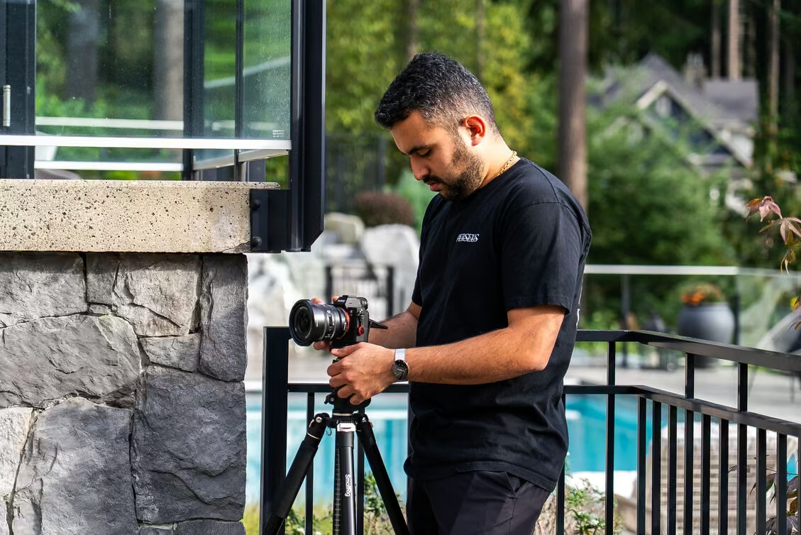
Recent Branding work.
A look at real branding engagements from the Perseus archive — the work behind Logo & Visual Identity.
More branding services
From the same senior team.
Other branding disciplines that pair well with logo & visual identity.
Distinctive
Expected
Brand Strategy & Positioning
Define what you do, who it’s for, and why customers choose you.
“Production that earns a second look.”
Brand Messaging & Copywriting
Tagline, tone of voice, and the words that actually sell.
Creative Direction
A creative north-star that keeps every channel consistent.
Brand Guidelines
Logo, color, type, and voice rules your whole team can use.
Other things we make.
One team, every discipline.
Most projects touch more than one discipline — here are a couple of highlights from each of the others.
 Production
Videography
Cinematic commercials, brand films, and event coverage.
 Production
Photography
High-end product, lifestyle, and brand photography.
Website Design
Conversion-focused UX that turns visits into leads.
Website Development
Fast, secure, SEO-ready builds on modern stacks.
SEO
Higher rankings and qualified organic traffic that compounds.

Google Ads
Search & Performance Max campaigns that capture high-intent demand.


Social Media Management
Content calendar, posting, captions, and community — accounts kept active and on-brand.
Social Strategy
Content pillars and a plan that ties posts to business goals.
Frequently Asked Questions
Clear answers before we start.
Scope, process, and deliverables for logo & visual identity — answered before we start.